

Brand book
The Brandage look,sticker by sticker.
The colours, type, shapes, characters, photography and voice that make the store feel like Brandage, so every new page, email and photo feels like part of the family.
Every colour and size here is read straight out of the live theme as you look at it, so this page can’t quietly drift out of date.
Brandage in a nutshell
Tatts. Not Tears. Everything else in this book grows out of those three words.
What it is
Children’s adhesive bandages with a temporary tattoo built in. A real bandage first; the tattoo is what makes taking it off the good part.
Who it’s for
Parents, grandparents and teachers of little ones who dread the bandage coming off, and the kids who end up asking for one.
How it feels
Bright, warm and a little cheeky. Big friendly type, chunky outlines, polka dots and a crowd of happy characters, all resting on a calm, trustworthy navy.
Brandage is an Antix brand. Everything in this book is already working on the store; it’s written down here so the next campaign, email or packaging photo can feel the same.
The logo
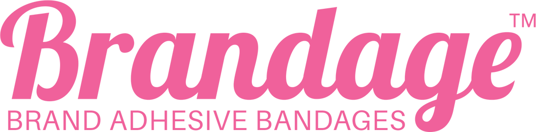
A bubbly pink script that reads as friendly from across the room. Here’s where it lives and how to keep it looking its best.

Do
- Use the supplied logo file, never a retyped version.
- Keep clear space around it, at least the height of the “BRAND ADHESIVE BANDAGES” line on every side.
- Keep it readable: in the header it shows at 46 px tall on computers and 38 px on phones (Brandage header › Logo height).
Don’t
- Stretch, squash, rotate or outline it.
- Recolour it outside the palette, or set it in a different font.
- Place it over a busy photo where the script gets lost.
Colour
Navy keeps it trustworthy, pink and yellow keep it fun, and cream keeps it soft. These are the exact colours the store uses.
The core five
- Navy#2A2B6E The calm, trustworthy base: headings, the header, outlines and the dotted bands.
- Pink#F0619B The fun one: main buttons, the cart button, focus rings and little accents.
- Yellow#F5E14B Sunshine for highlights: the announcement bar, the second hero line, button hovers.
- Cream#FFFDF6 The page itself, and text on navy. Warmer and softer than plain white.
- Ink#16183A Body text, the chunky outlines and the footer. Used instead of black.
Supporting colours
- Sky#A8D6E8 Soft text on dark grounds, like the footer.
- Pale#EAF1FF Gentle panels, review cards and the tattoo tiles.
- Pink soft#E8A0C6 Outlines and links on dark grounds.
- Pink tint#FFF6FA The softest wash, for friendly warnings.
- Muted#3D4166 Secondary text: intros, captions, small print.
- Navy dot#3A3B84 The polka dots on navy bands.
- Pale dot#CBDAF5 The polka dots on pale bands, and quiet dividers.
- Amber#E0851F Review stars, and nothing else.
- Error#B0246A Form messages when something needs fixing.
- Near black#0B0B0D Only the scrolling “why parents trust us” strip.
Pairings that are easy to read
Each pair below is measured live: the ratio compares how light the two colours are, and everyday text needs at least 4.5 : 1. Big headings can go as low as 3 : 1.
- Aa Ink on CreamBody text everywhere 16.83 : 1 Passes
- Aa Navy on CreamHeadings and links 12.36 : 1 Passes
- Aa Muted on CreamIntros and captions 9.61 : 1 Passes
- Aa Ink on PinkMain button labels 5.62 : 1 Passes
- Aa Ink on YellowThe announcement bar, hovered buttons 12.85 : 1 Passes
- Aa Cream on NavyHeader links, text on navy bands 12.36 : 1 Passes
- Aa Yellow on NavyBig headings on navy, like “Not Tears.” 9.44 : 1 Passes
- Aa Sky on InkFooter text 10.97 : 1 Passes
- Aa Error on CreamForm messages 6.24 : 1 Passes
- Aa Pink on CreamShapes, numbers and very big type only, never small text 3.00 : 1 Big type only
- ★ Amber on CreamStars, always next to the rating in words 2.73 : 1 Decoration
Type
Two typefaces: one big and bouncy for headings, one clean and easy for everything else.
HeadingsBagel Fat One
Tatts.Not Tears.
Everything elseInter
Finally, a bandage your toddler wants to take off. Press a wet paper towel over the cutout for 40 seconds and the bandage leaves behind a temporary tattoo.
Regular 400 Semibold 600 Bold 700 Extra bold 800
Bagel Fat One is for headings only: short, bold and friendly. It is always set in its one regular weight, never bold or italic, and never for long sentences. Inter does everything else, from body text at Regular to buttons and labels at Extra bold.
The size ladder
Headings grow and shrink with the screen. The figure in blue is the size on the screen you are reading this on; the range beside it is phone to big screen.
- Tatts.
- Pick your pack
- What parents say
- Which one will they get?
- Every box holds 20 assorted bandages.
- Put it on the way you would any bandage.
- Shop bandages
Shapes, lines and dots
Thick outlines, round corners and polka dots: the little details that make every band feel like a sticker sheet.
Brandage looks like a sticker sheet: thick ink outlines, soft rounded corners, pill-shaped buttons and polka-dot grounds. Those four things do most of the work.
Buttons
Pink is the main action, and there’s one main action per band. Every button turns yellow when you point at it, so the store always answers back.
Lines and corners
- Outline3px Around cards, buttons, photos and bands.
- Large corner20px Big panels.
- Card corner18px Cards, photos, reviews.
- Small corner12px Form fields, small tiles.
- Pillfully round Buttons, badges, the cart button.
Polka dots
The page frame
- Widest content1440px Bands stretch edge to edge; their content stops here.
- Side margin32px 32px on computers, 24px on tablets, 18px on phones. The figure is this screen’s.
The tattoo characters
The new friends that turn bandage-off time into the best part of the day.
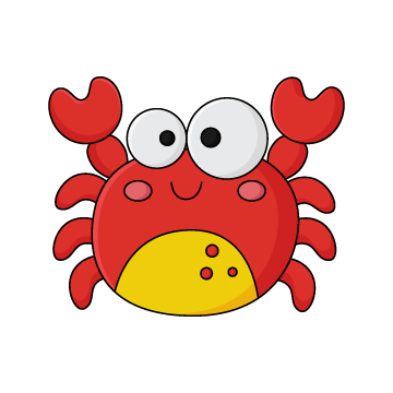
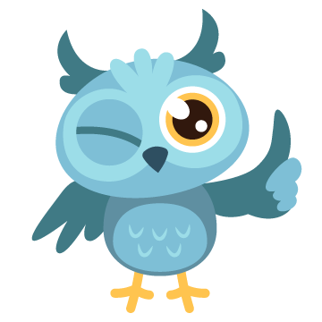
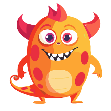
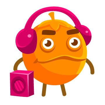
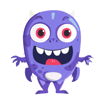
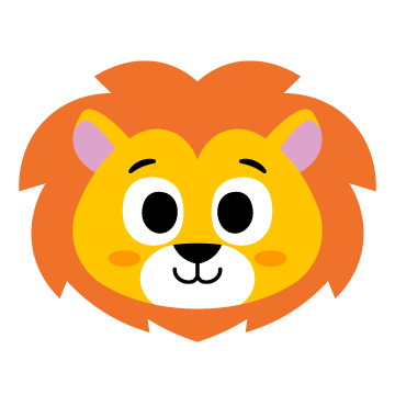
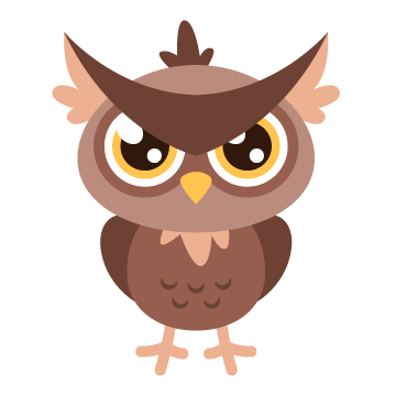
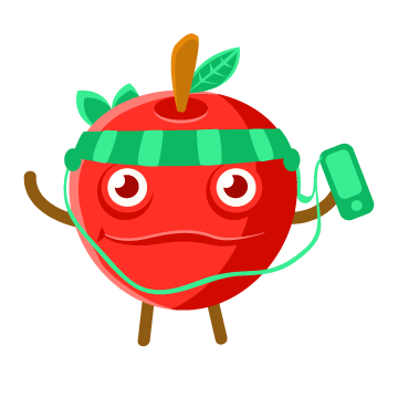
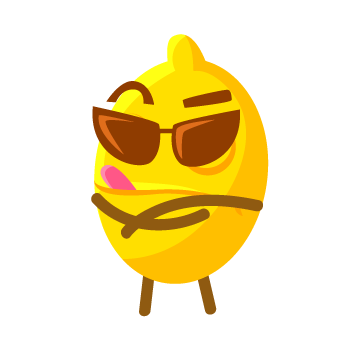
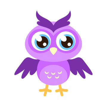
The tattoo characters are the stars of the show: a crab, a cat in glasses, a cool ghost, a lion and over a hundred more friends hiding under the cutouts. On the store they sit on pale tiles with a navy outline, and they give a little wiggle when you point at them.


Do
- Show them big and happy, with room to breathe, on cream or pale grounds.
- Mix them up: a crowd of different friends says “which one will they get?”
- Use the cut-out PNG files with transparent backgrounds.
Don’t
- Redraw, recolour or crop them, or give them new expressions.
- Put them over busy photos where they get lost.
- Use one sad or scary-looking character on its own. The whole point is cheerful.
Photography
Bright, simple and real, always showing the happy ending.
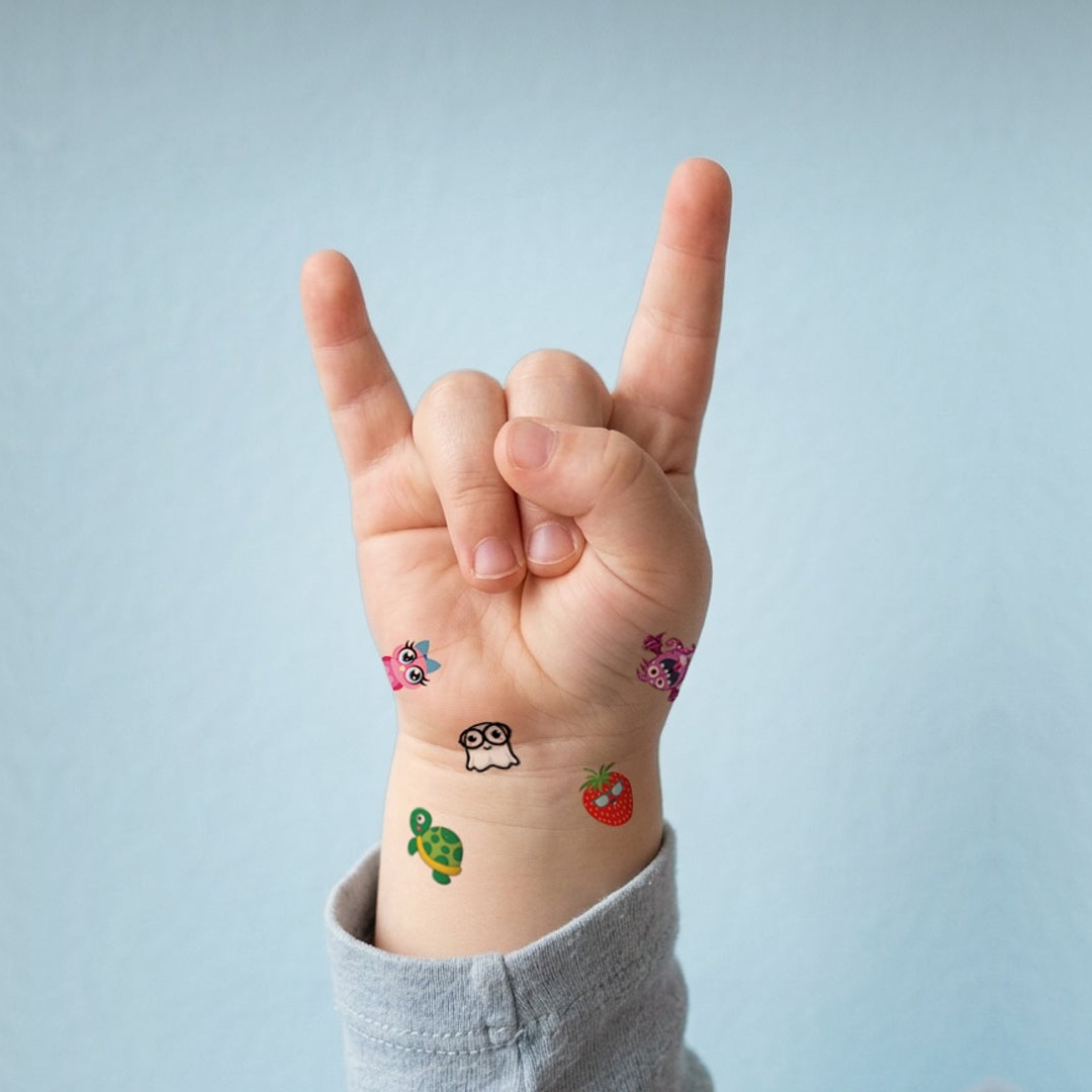
The payoffTattoos on a little wrist, plain pale-blue wall. 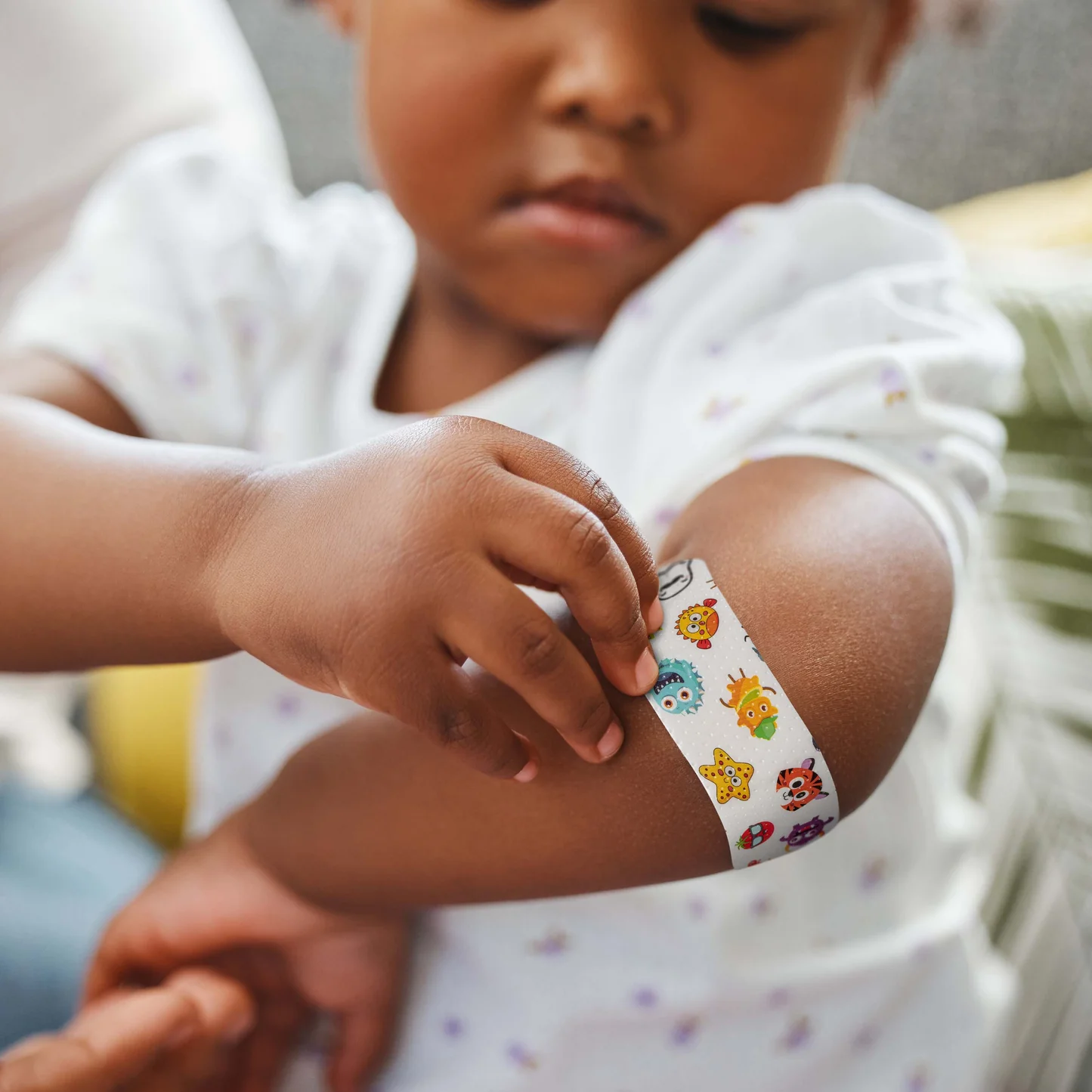
The momentA real child, a real bandage, natural light. 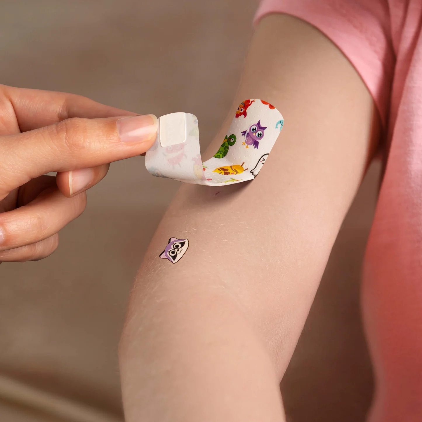
The revealClose up, the tattoo left behind as the bandage lifts. 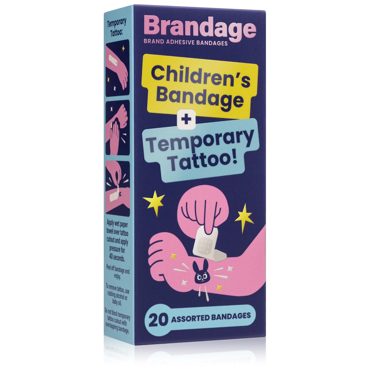
The packBoxes straight on, clean white ground, soft shadow. 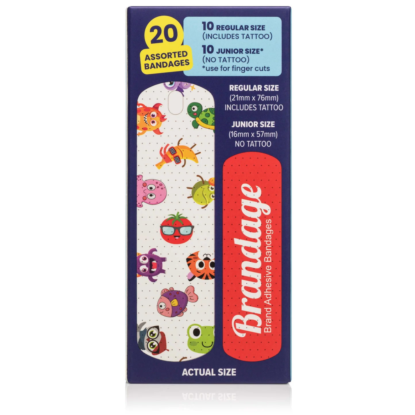
The detailsBox and bandages shown flat and readable. 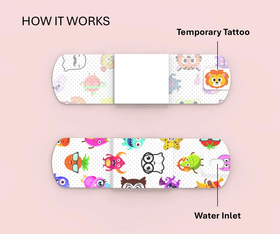
The explainerSimple diagrams on a soft pink ground.
Look for
- Real kids, real skin, real moments, in bright natural light.
- The tattoo in focus and easy to spot.
- Plain, soft backgrounds (pale blue, cream, white) so the characters pop.
- Square crops that still work when trimmed to the middle.
Avoid
- Wounds, blood, or crying children. We show the happy ending, not the scrape.
- Busy, dark or heavily filtered scenes.
- Other bandage brands in shot.
The explainer illustrations (flat navy grounds, a pink arm, yellow sparkles) are part of the same family. Use them to show how it works, and photos to show that it works.
Voice
How Brandage sounds, in headlines, buttons and emails alike.
Brandage talks like a parent who has been there: warm, quick, a little cheeky, and completely clear about what’s in the box. One smile per line is plenty.
Tatts. Not Tears.
The home page heroFree shipping on 2 boxes or more — that’s 40 bandages, and nobody cries about postage.
The announcement barIt’s a real bandage first. The tattoo is just what makes taking it off the good part.
The product pageTwo or three emails a year. Unsubscribe any time.
The newsletter sign-up
Do
- Lead with the feeling (no more tears), then back it with a fact: 20 bandages, 40 seconds, two boxes ship free.
- Keep sentences short, and say “you” and “your little one”.
- Call the characters “new friends”, and keep the surprise alive: “Which one will they get?”
- Say bandage or adhesive bandage.
Don’t
- Say “Band-Aid”. It is another company’s trademark.
- Invent medical or safety claims. Stick to the ones already on the store (electron-beam sterilized, not made with natural latex, tattoos made in the USA, NAPPA Award winner) and check new ones with the team first.
- Dwell on pain, blood or injuries.
- Pile on the puns. One good one beats three.
Motion
A wiggle here, a glide there. Never more than a smile’s worth.
Movement on the store is small and playful, and it never gets in the way. Point at the stages below to try them.
-
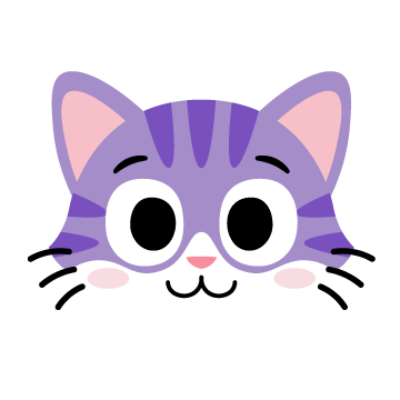 The wiggleTattoo characters give a quick, happy wiggle when you point at them.
- Point at me The answer-backButtons turn yellow in a blink and press down a touch when clicked.
-
 The scrolling stripThe “why parents trust us” strip and the announcement bar glide slowly and loop.
Good to know
Anyone whose device asks for reduced motion gets a still store: the loops stop and the wiggles stay put. Keep new animations to that same rule: short, gentle, and optional.
Every colour, size and contrast figure on this page is read straight out of the live theme as the page loads. With scripts switched off, you are seeing the values the page was written with.
Got something new in mind?
Let’s make it look like Brandage.
New packs, a seasonal campaign, a fresh set of tattoo designs: we can bring them onto the store in the Brandage style, so they feel like they were always there.
- Campaign pages
- New sections
- Product launches
- Seasonal refreshes
Power Commerce designed and built the Brandage store.
This brand book is a page of the Brandage theme, written by Power Commerce at handover. It is kept out of search engines and isn’t linked from any menu. The swatches, sizes and contrast figures are measured from the theme while you read. Its companion, the store playbook, explains how to change things on the store.